Enhancing Public Health Efforts with Real-Time Data Monitoring: The Center for Health Equity Launches the Data Visualization Studio
By Wes Gibson
The UTHealth Houston School of Public Health’s Center for Health Equity (CHE) has extensive expertise in building interactive data visualization tools to enhance public health research and practice. Keeping track of performance data of programs and services in real-time is critical for ensuring that health initiatives stay on track and are successful.
If programs and interventions are not implemented as planned, they will not have the desired impact. The CHE Data Visualization Studio helps both funders and implementers create sight lines with real-time monitoring to optimize performance and demonstrate its impact. These data visualization tools allow for performance guarantees in direct connection with the programs and interventions being implemented to improve community health.
CHE’s Data Visualization Studio offers the following services:
- Building and implementing real-time monitoring dashboards in Microsoft Power BI to track Key Performance Indicators (KPI) for program implementation and evaluation projects: These cross-sector collaborations involve collecting data from a variety of sources to present in a simple and accurate format in Power BI. Through these efforts, CHE ensures its projects proceed in line with the center’s goals. For example, the team has recently built KPI dashboards for various Food is Medicine studies in the Greater Houston area. In these projects, data is pulled from participating health systems and Food is Medicine implementers to analyze and visualize performance metrics across all health systems. These data are readily available to all providing opportunity for troubleshooting of implementation challenges in real time.
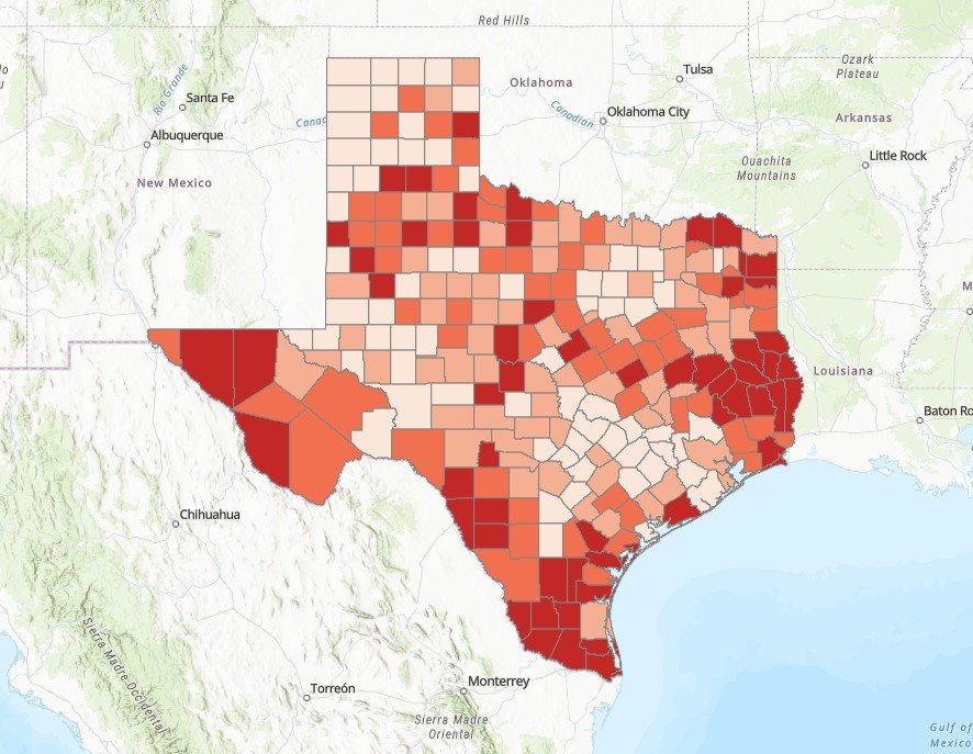
- Create clear, impactful maps using ArcGIS Pro to visualize and analyze geographic trends: Under the guidance of CHE faculty member, Ryan Ramphul, PhD, MS, an expert in spatial epidemiology and food access research, we have created various maps that permit stakeholders to assess the impact of regional investments in community health initiatives with real-time mapping. For example, his team recently mapped a dashboard presenting affordable housing investments near the Columbia Tap Trail in Houston, Texas with the goal of creating or preserving affordable units in this area.
Our team of data scientists, cartographers, and statisticians transforms complex data into actionable insights, empowering organizations to make informed decisions and drive measurable impact.
This approach is brought to life as Ramphul explains, “The Data Visualization Studio is transforming how public health initiatives are designed and evaluated. By leveraging real-time dashboards and spatial mapping, we’re giving funders and implementers clear sight lines into what’s working, where, and why. It’s not just about data — it’s about empowering communities with the tools to ensure health interventions deliver measurable, lasting impact.”
Anyone interested in finding out more about this paid consultative service can contact Wes Gibson, MPH, Senior Program Manager with the CHE who has ample experience in systems science, partnership engagement, and data visualization.